Role: Lead UX Engineer
Team: Solo
Time Constraints: 2 Week Sprint
GYST is a minimalist habit tracker app, designed to provide the user with a sustainable way to monitor daily habits and self care.
GYST is focused on accessible asks, ie. did you move your body? did you sleep? how do you feel? vs. more overwhelming quantitive data tracking. This mobile app takes the busy, burnt out, ADHD mind into account to create a user experience that is easy to understand, and easy on the eyes.

Problem Statement: There’s a hole in the habit tracker market for people who just need a little bit of help taking care of their bodies. Too often apps are strongly geared towards working out, losing weight, or “being productive”, and the presence of these messages is enough to send softer souls into a spiral. The goal of GYST was to create a simple, streamlined, and visually calming app that felt accessible for those who struggle with daily self care due to depression, ADHD, burnout, or any of the many reasons life can feel too overwhelming. A secondary but very important goal was for GYST to be gender neutral - giving a blank slate for all gender expressions to work on themselves, one day at a time.

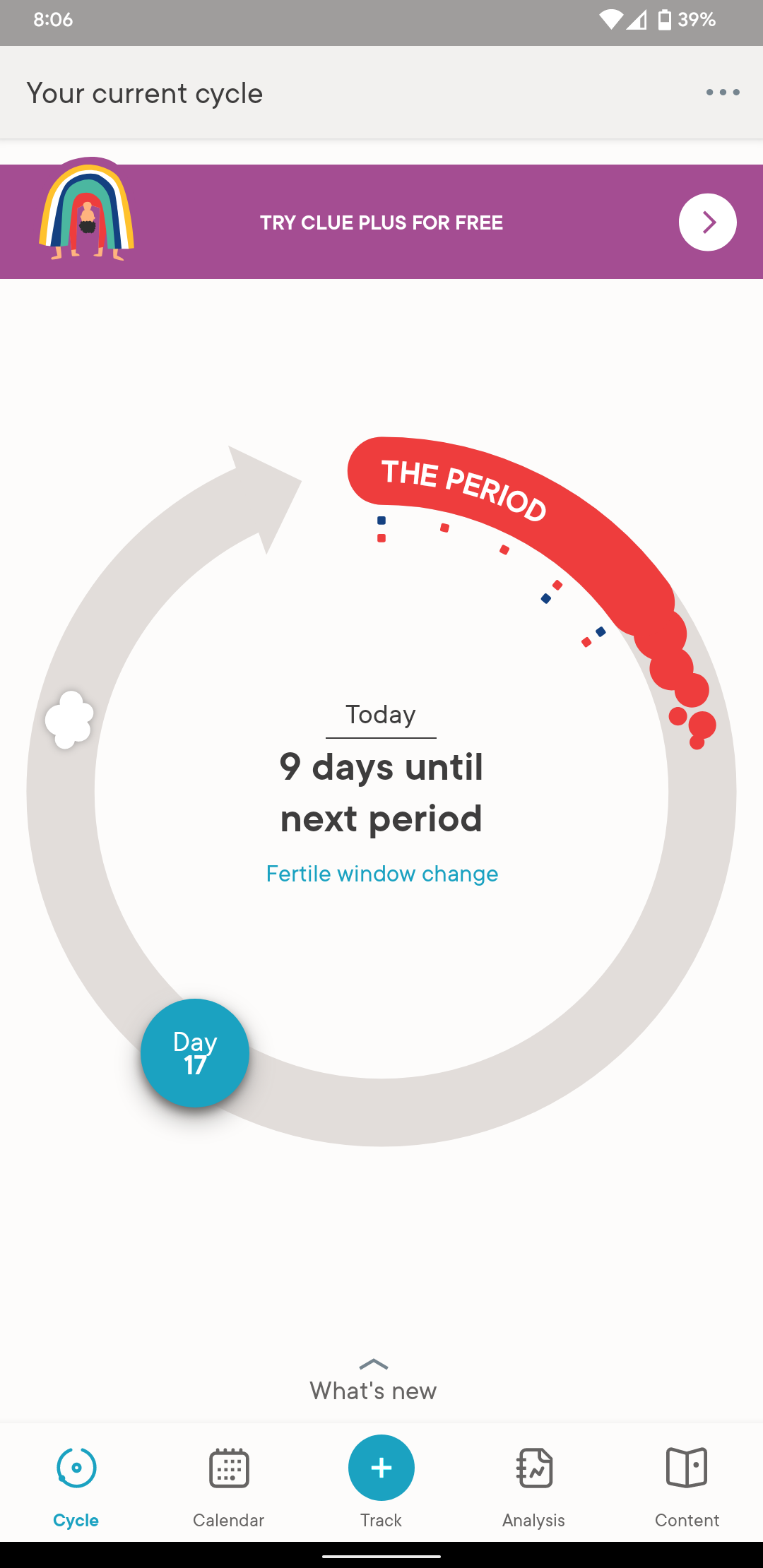
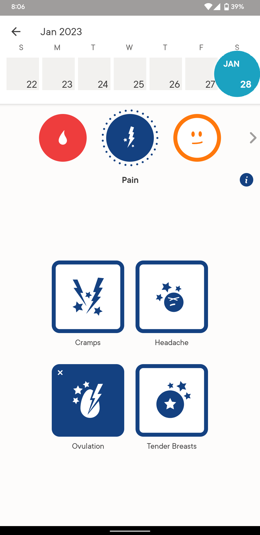
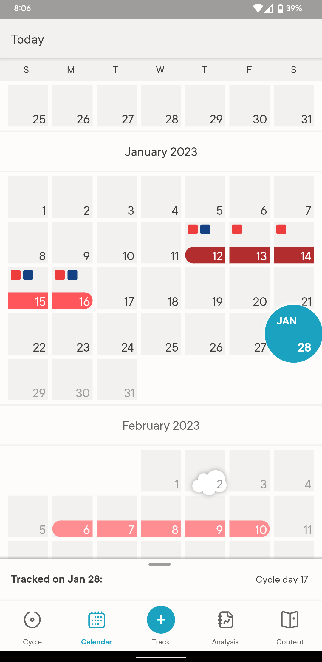
Competitive Analysis: One app in particular stood out for its excellent user flow and visual cues: the period tracker Clue. Clue utilizes clever iconographic buttons and simple data graphics to display the user’s menstrual cycle and symptoms at a glance. The inclusion of common symptoms and cycle variations makes it easy for the user to quickly note their condition without getting overwhelmed or struck with decision fatigue during a time they might not feel their best. This was important to emulate when designing GYST, as a huge part of making the app effective is ensuring that even during a bad mental health day or seasonal depression cycle, users will still be able to track their self care with minimal stress.